Signed In Homepage – Improving Tool and Content Discovery
Summary
The signed-in homepage provides access to tools and content based on users' roles, along with featured content. With diverse responsibilities, members often struggle to find what they need. I designed and tested solutions to improve access, customization, and content visibility.
Problems to Solve
Users struggle to find tools and resources to complete specific tasks for their role.
The business wanted to increase user content views.
My Role and Collaboration
My Responsibilities
User experience design
Usability and AB testing strategy
Wireframes and prototypes
Collaborating with developers
Stakeholder collaboration, negotiation, and alignment efforts
Team
Product Manager
Developer
Functional Analyst
User Researchers
How I Came to My Proposed Solutions
Existing research: Intercept surveys showed that most users visit the site to complete tasks, not to read articles. This conflicted with the business goal of increasing content views.
Best practices and third-party research (thanks, NN/g): this informed labeling My Links instead of "Quick Links." I also applied best practices for carousels, web content, and headings
Analytics: Users visit the site to complete tasks, often bypassing content to access tools, which conflicts with the goal of increasing content views.
AB Testing: Helped to understand the positive impact of moving My Links to the top of the page and the importance of content titles and descriptions.
Usability Testing: Helped understand the challenges of customization and the wide range of user needs. Helped give our team ammo to simplify the page.
Team Collaboration: discussing ideas with product managers, developers, content strategists
My Solutions and How They Addressed the Problem
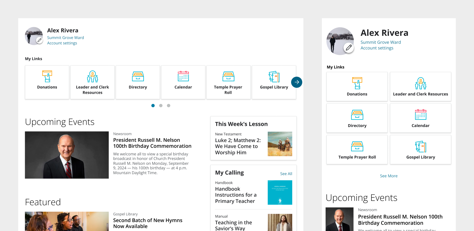
Increased visibility of My Links
Moved “My Links” to the top of the page and paired with icons. These were previously small, on the right sidebar of the page and, on mobile, near the bottom of the page. From the initial user study I read, I knew these links were essential for aiding people in getting their jobs done. AB testing confirmed this.
Impact: Increased clicks to My Links by 994%.


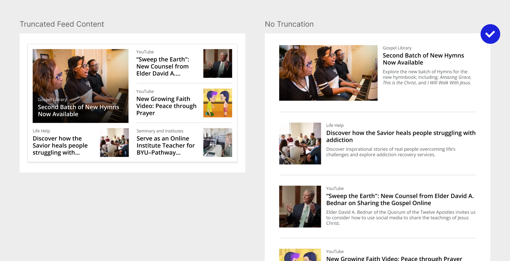
Ensure tile headings and description are visible
Previous iterations truncated headings when they got long, forcing users to guess and decreasing content clicks. I created layouts that allowed us to display headings and descriptions regardless of text length. AB testing confirmed that this increased clicks to content. It also helped us understand that people may be more interested in content on a page like this than we initially thought.
Impact: Increased clicks to featured content by 26%.
Other Concepts Explored
I explored customization by researching and designing ways for users to tailor their links. Page feedback suggested demand, so a basic version was launched, but only 1-2% used it. User testing revealed that the real issue was irrelevant links, not a lack of customization. Instead of a complex editing tool we moved towards an improved link lists and reduced link options. Doing a round of user testing saved us from building out unneeded features.
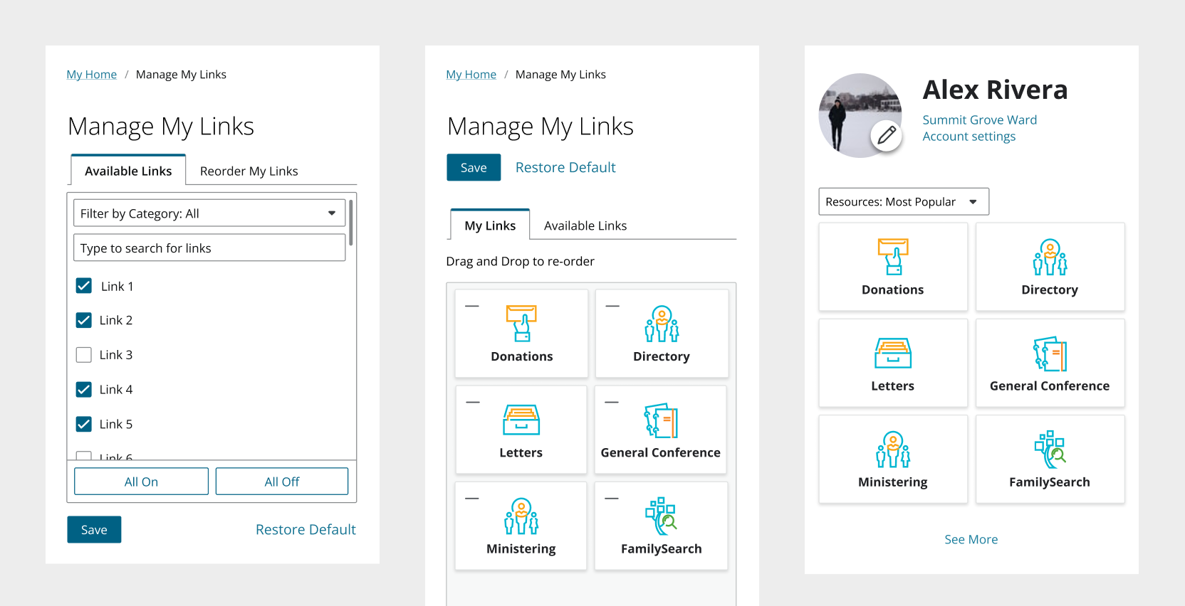
Usability testing helped our product team learn that these were more complex than what our users needed.
Insights
Regular user testing prevents inaccurate assumptions and costly technical debt. Frequent feedback keeps the product team grounded in how users truly interact with the product.